In this guide, we will show how best to make your Table, cover essential elements such as rows, columns, Insight rows, filter rows and more measures. The table is the one you find under the Dashboard and contains exactly the KPIs that are displayed in your Dashboards.
Master Insight
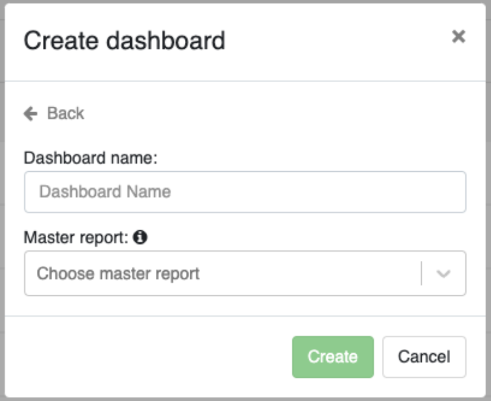
For all Insight, there will be a Master Insight attached. This must be selected when creating a new Insight. The selected Master Insight will be marked in bold and will be placed in the first row in your table.
The Master Insight is the basis for your Filterrows (Read section Filterrows).
You can change the name and location of your Master Insight and you can also hide it in the table. You choose it here:
Rows and Columns
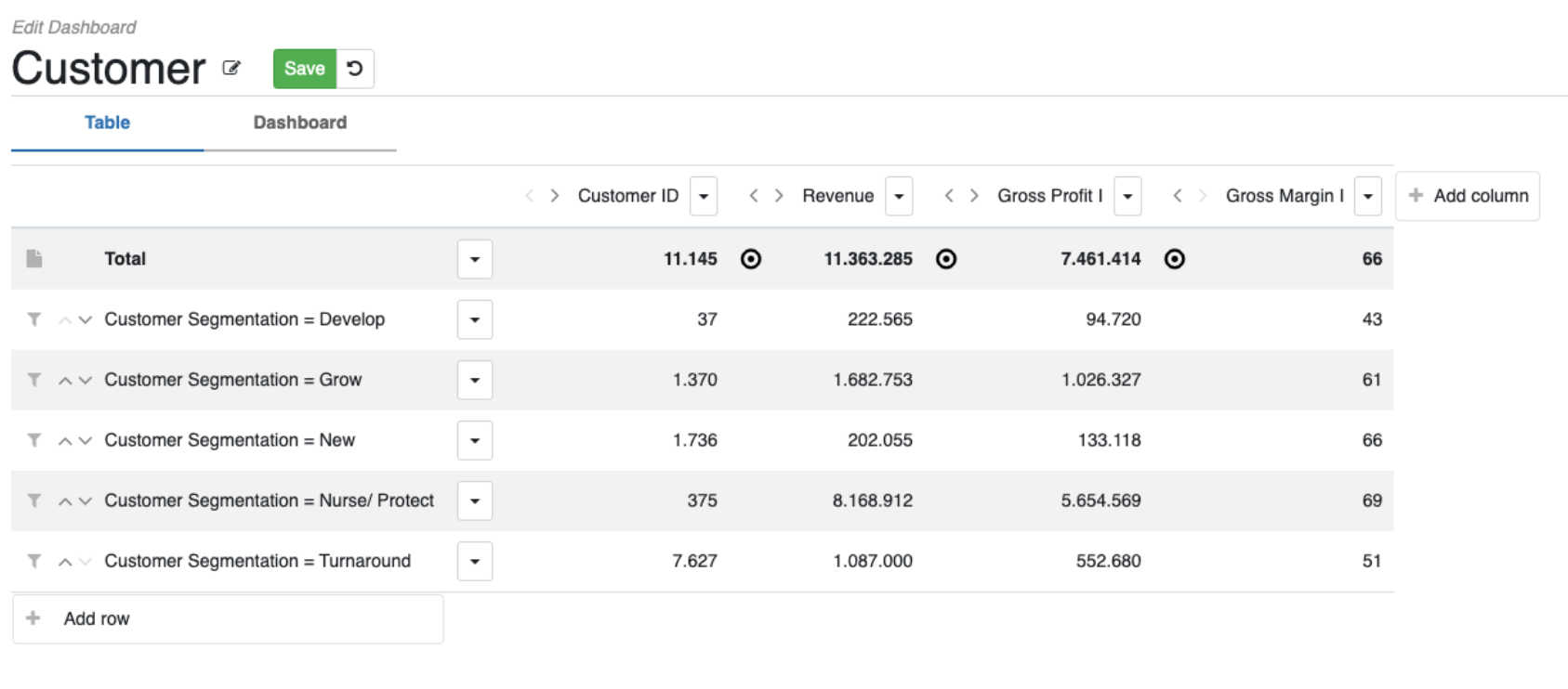
Your table is arranged systematically in intersecting horizontal and vertical rows (rows and columns). When creating a table, it is fundamental to understand rows and columns:
Column: These represent the horizontal sections of your table. Each row can contain a column from the Dataset you have selected. (You can select columns from other Datasets, however, it is not certain that the data will match). The columns can for example contain Columns such as: “Revenue 12 month.”, “Gross Margin %” and “Inventory Turn Ratio”.
To select a column, press the “Add Column” button to the right of the table.

Here you must choose the following:
- Column (Which column to use)
- Aggregation (Which KPI figures to display)
- Categorization (An additional filter based on the active
- Categorization for the selected column)(NB: This is not required)
- Percentage and/or Decimal (numbers must be displayed as decimals or percentages) (NB: This is not required)
- Label (Should the column be named something other than the original column name.

Rows: These are the vertical sections of your table that represent different columns as you know them from the Insight. As a starting point, the first row will be the Master Insight, which will usually be a Total Insight. From here it can be smart to have different benchmarks below. It could be Countries, Sellers or Stores. It can also be other numbers from other Insights in your Inact Now.
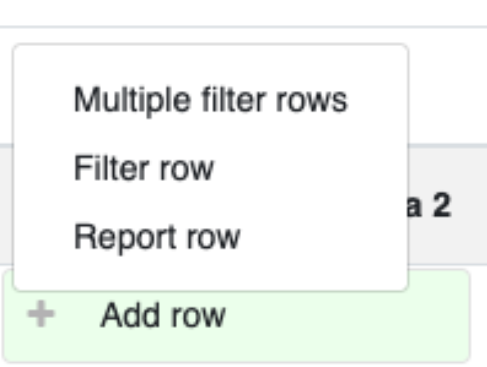
You add a “Row” on the “Add Row” button, which you find on the last row of the table. Once you have selected a row, choose from the following:
Insight Row – Based on a filter from an existing Insight.
Filter Row – Based on the Master Insight and a filter you create yourself.
Multiple Filter Rows – As above but multiple and based on a single filter.
You can always change the order (by pressing the arrow keys) and content of rows and columns by pressing the row/column you want changed.
Insight rows
Insight Rows are based on your existing Insights. To select this row, press “Insight Rows” and from there select which Insight you want to see and a possible Label that will act as a heading for this row.

The smart thing about an Insight Row is; that 1) you can select Data that is not available in your Master Insight 2) if you press this in a Dashboard widget you will land on a different Insight than the Master Insight.
Filter rows
Filter rows allow you to create a filter on your Master Insight. By using slicers on the Master Insight instead of an Insight Row, you can avoid making Insights, exclusively for a row in a Dashboard. If you click on a Filter Row, you will be sent to the Master Insight with the Filter you have selected.

Get many rows at a time by using the “Multiple filter rows” function. This feature allows you to quickly get several rows at once. However, you must be aware that it is only possible to use one filter in this. However, additional filters can be added subsequently on each individual row.
Targets
Setting up Targets in your table allows you to set goals or benchmarks for your data. You can set your target on your table or directly on the Dashboard Widget. (read about Widget in Dashboard here) If Target is set in Table, it will appear both in the table and in the Dashboard itself. If, on the other hand, it is inserted directly into the Dashboard Widget, it will not appear in the Table.
You put your Widget in the table by pressing the button
to the left of the desired KPI.
There are two primary types to set your target on:
Number target: A number target is the simple way to set a target, as the target here will have a fixed value that you manually set and therefore only change by entering a new Target yourself.
Table Target: Table Target is a dynamic target that points to a column in your table. In this way, your target will adapt based on the data you choose yourself. They can be linked to variables or formulas, enabling more adaptive targeting based on real-time data.
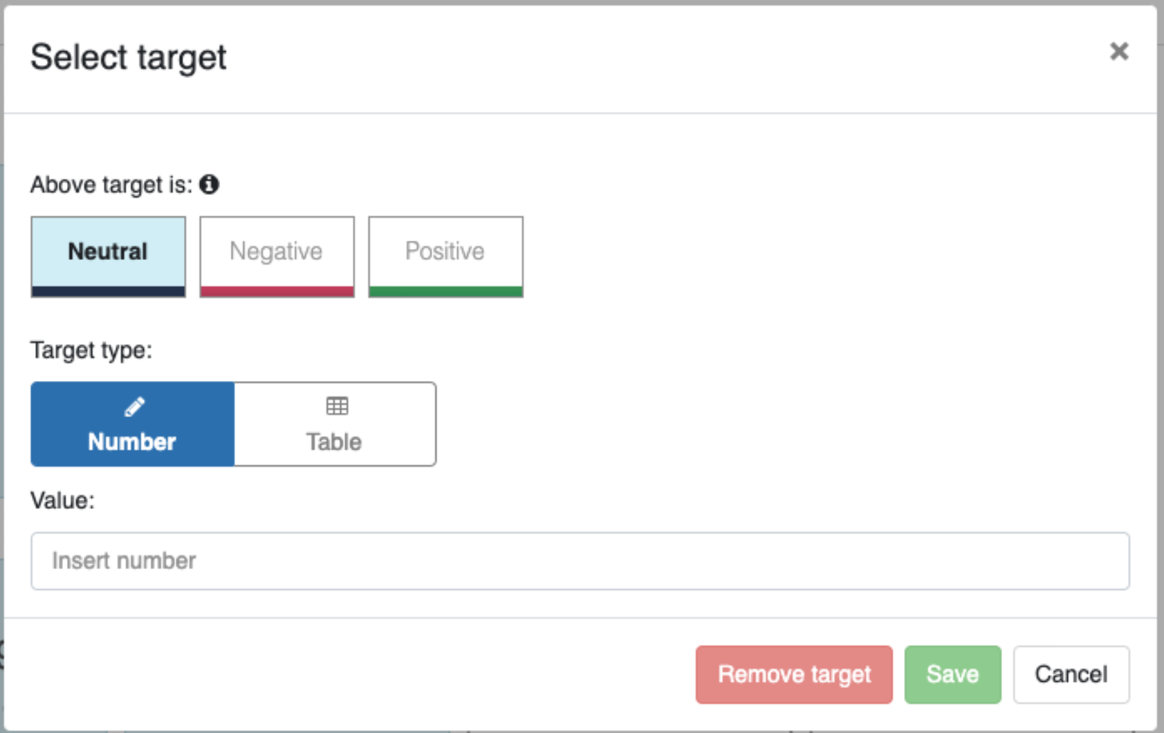
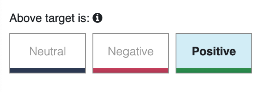
When Target is selected, the result will by default be neutral and therefore show a Dark Blue color in the bar under the Dashboard. To change this, pick a trend at Target. This is done in the menu above Target Type. Here you must choose whether the Dashboard should be positive (Green) or red (Negative) if the KPI is above target. In the picture here, the Dashboard will be green if the target has been reached.
By ensuring a good setup of the table; rows, columns and Targets, you are well on your way to creating your own personal Dashboard and thus getting the most out of our platform.
If you have any questions or need further assistance, our support team is here to help!