Reports are for those who want to analyze your data and are the first step in the creation of both Dashboards and Checklists. Both Dashboards and Checklists are initially created based on a Report, often the best results are achieved if they are built based on a Total Report that contains all data.

All reports in inact Now are built around 3 basic elements that are important to keep track of:

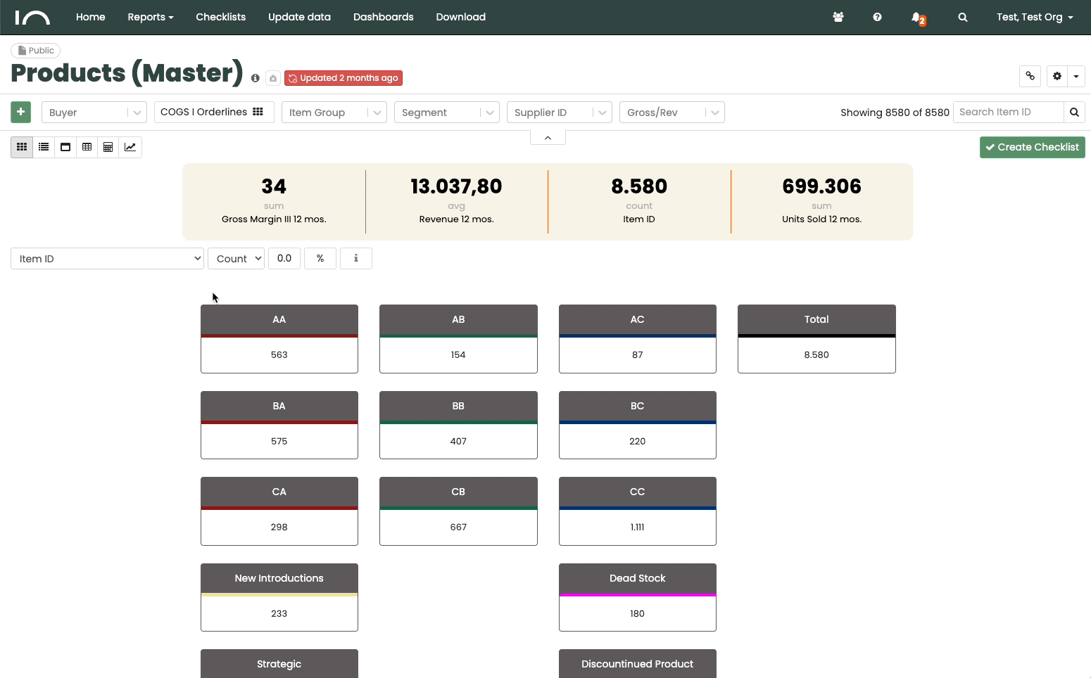
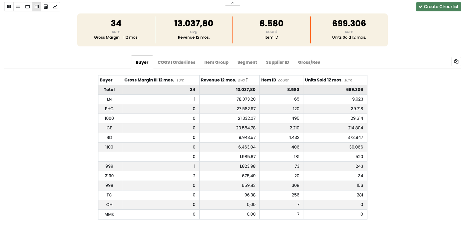
  • Data – A report is defined in terms of which data and topics are included in the report.
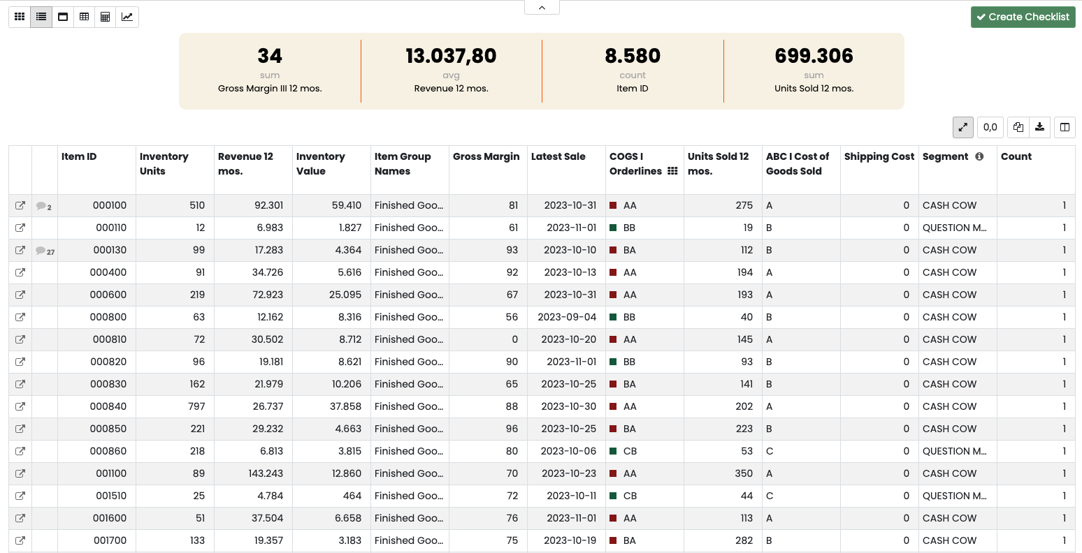
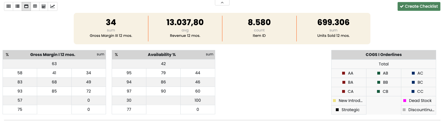
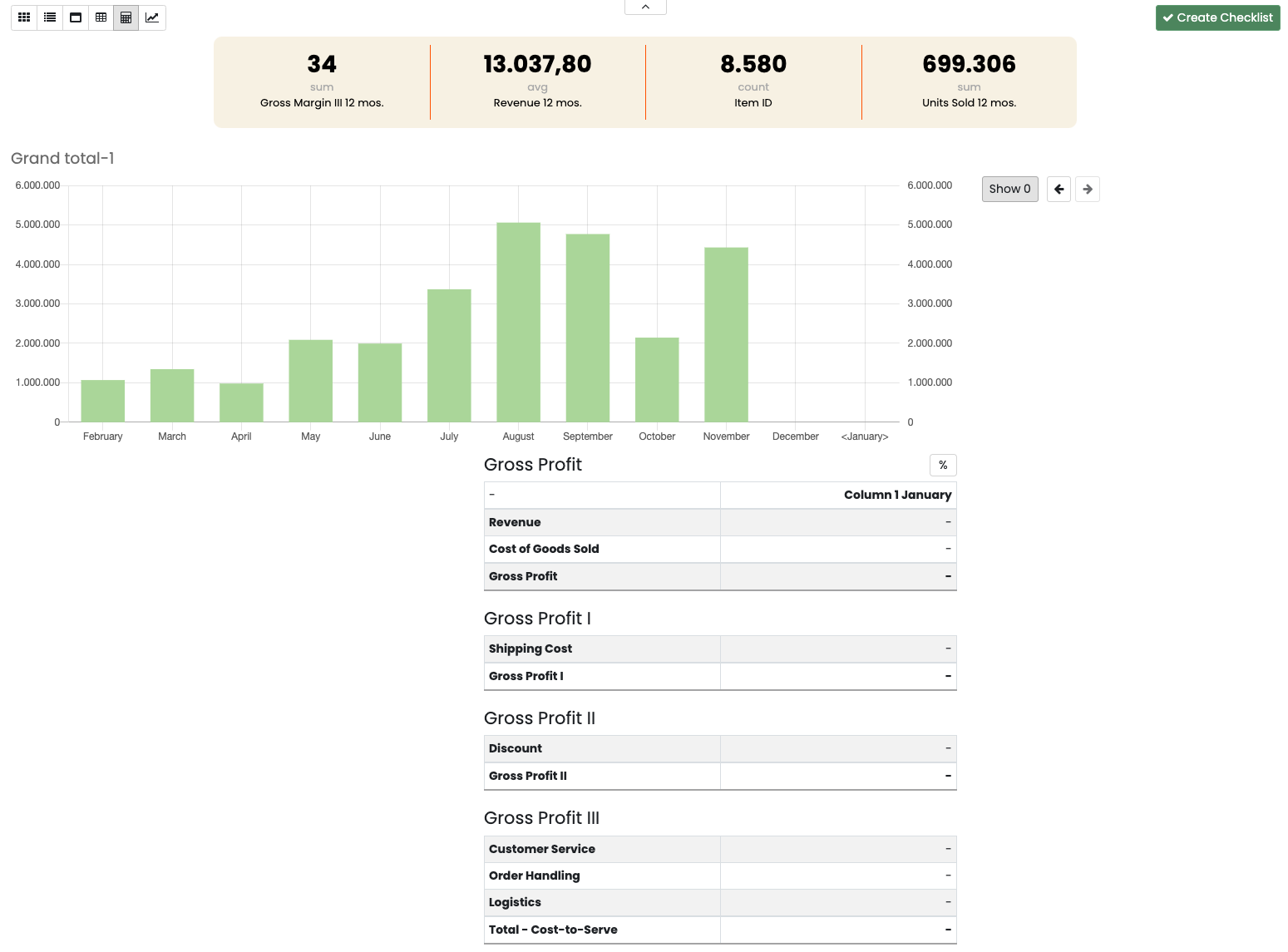
  • Visualization – The report can visualize your data in 5 different ways. Depending on the purpose of the report, one or more of these views can be enabled or disabled by your administrator.
  • Search & filter – No matter where you are in Inact Now, you can always filter/slice on individual topics or groups. So you can analyze exactly what you want.

Views in Reports

When setting up your Report, it is important to decide which views should be available. You have the following options:

  • Matrix view
  • Grid view
  • KPI view
  • Sumsheet
  • Profit view
  • Trend View
View Reports

Matrix-view

This is where you start your analysis of your company’s products, customers or suppliers. The Matrix you see will be the main matrix set up for the Data Source the report is based on.

In your matrix view, you can see the segmentation model and analyze the individual segments.

Use the dropdown menu on the left to see, among other things:

  • Number of SKUs per category.
  • Inventory value per category.
  • Revenue per category.
  • Then choose to see the percentage breakdown of revenue per category.

You can always dive into the individual category and see which product numbers are underneath.

Matrix VIew

Grid-view 

Grid shows your data in tabular form.

In Grid view, you can choose which columns you want to see and in which order. You can also search by item number, supplier, item group, etc.
From the Grid view, you can drill down to the individual Master Data for each item, which can either be a single item number, a single customer or a single supplier.

Grid view

KPI-view

Get a strategic overview of your KPI performance.

In KPI view, you can compare your KPI performance per category and analyze the areas where your company can improve. For example:

  • How is revenue distributed in the categories?
  • How are costs distributed in the categories?
  • Which categories are profitable?
  • Which Service Level Agreement should we have in each category?

Tip #1. Highlight a category you want to focus on.

Tip #2. See the numbers per category as actual values or %.

Tip #3. Tap on a category to see what topics are hidden under it.

KPI view

Sumsheet

Sum view compares your key figures across product groups, suppliers, category managers, etc.Your Sum view consists of:

  • Categories e.g. product groups on the y-axis
  • Key figures e.g. revenue, contribution margin and inventory value on the x-axis (max 4 key figures)
  • The report filters define the y-axis in the Sum view.
Sum View

Profit view

You can set up the Profit view to show total revenue, costs and contribution margin for a group of products, customers or suppliers.

Below you can see an example for an entire customer group.

Profit view

Trend view

Trend shows the historical development of the 4 selected KPIs you have chosen in the bar at the top.

Trend shows you the development of your KPIs month by month. You can choose to view the development as a bar chart or graph for the last 12, 24 or 36 months. Use the search function to see the trend per product group, supplier, etc.

Leave a Reply